OVERVIEW
PROJECT DESCRIPTION:
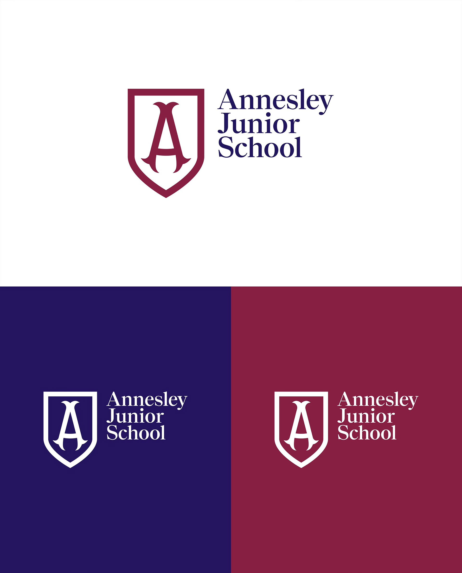
Annesley Junior School is a South Australian institution with deep roots and a progressive outlook. Originally founded in 1902 and later reformed as a junior school in 2012, Annesley’s mission is anchored in a contemporary, child-centred approach to learning.
Working with the school leadership and council, we were engaged to align brand strategy, identity and activation with that ambition. The outcome is a digital-first brand system that honours heritage while enabling growth and clarity across every touchpoint. As a leading Adelaide branding agency, we brought strategic branding and design craft to an education leader ready to scale its impact.
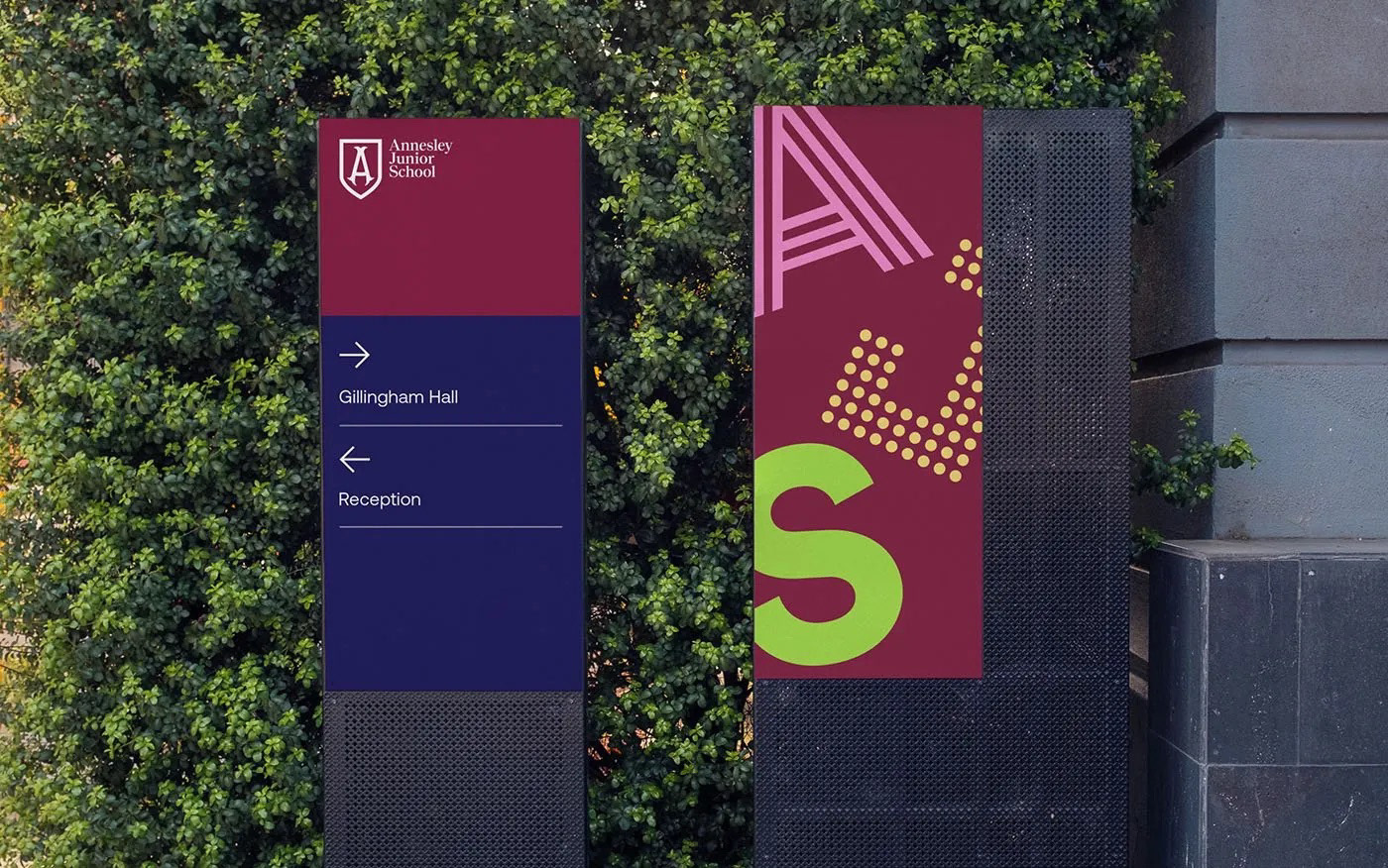
Refined shield mark for clarity and digital responsiveness while preserving heritage cues.
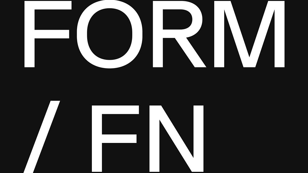
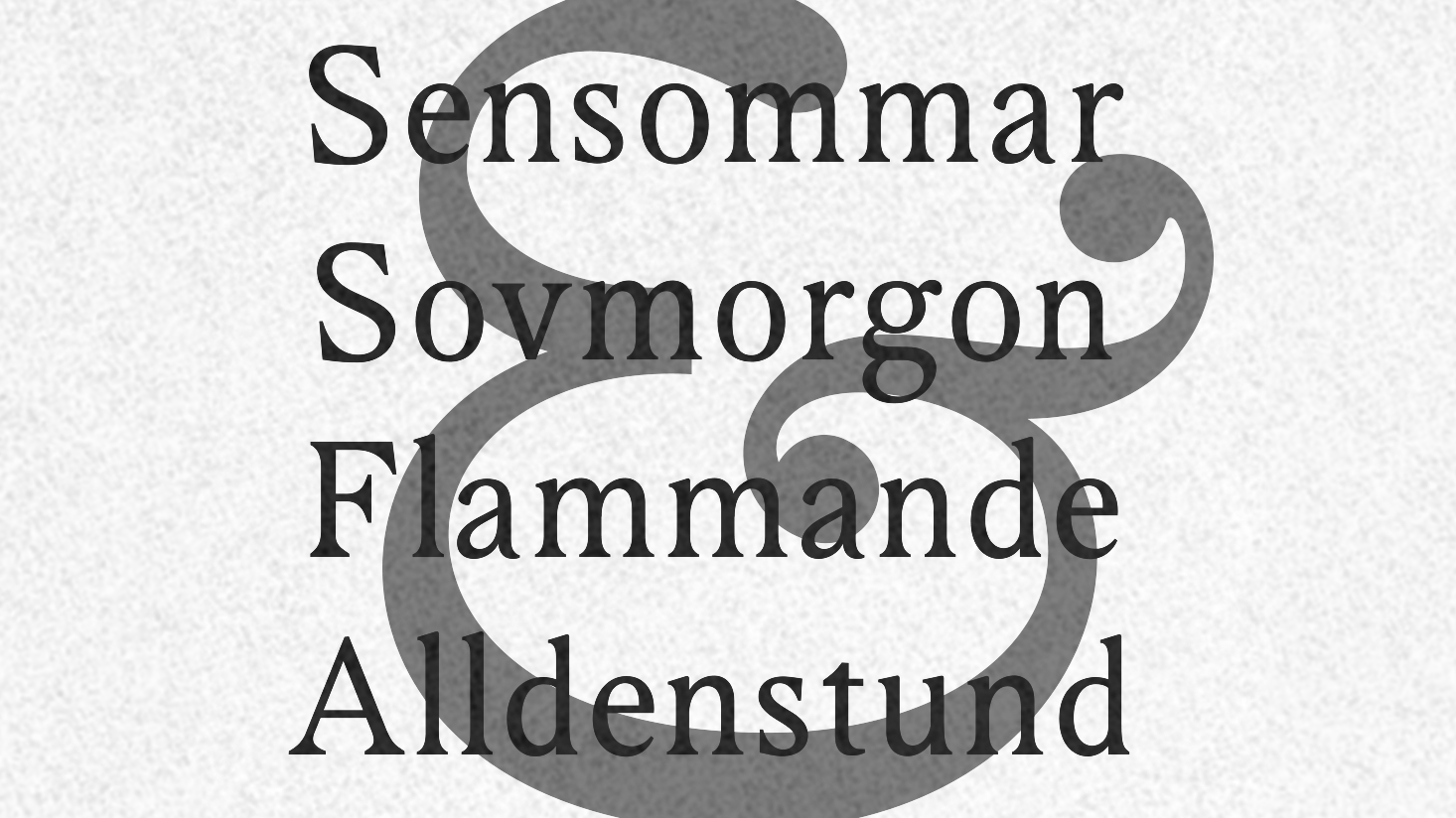
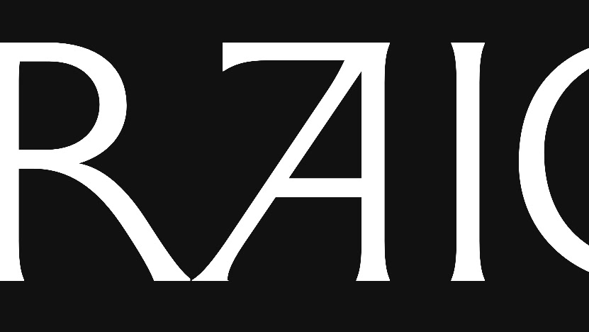
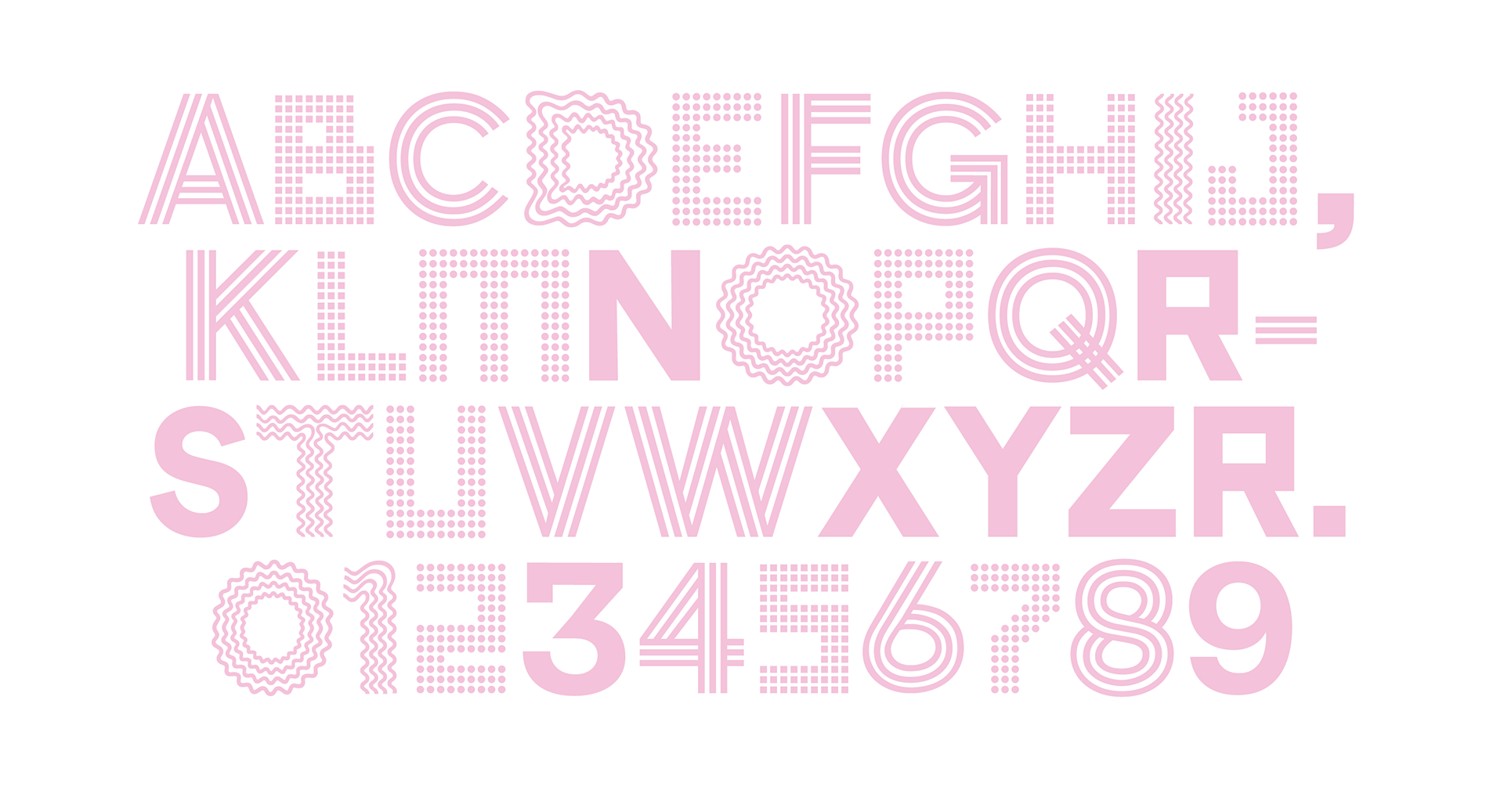
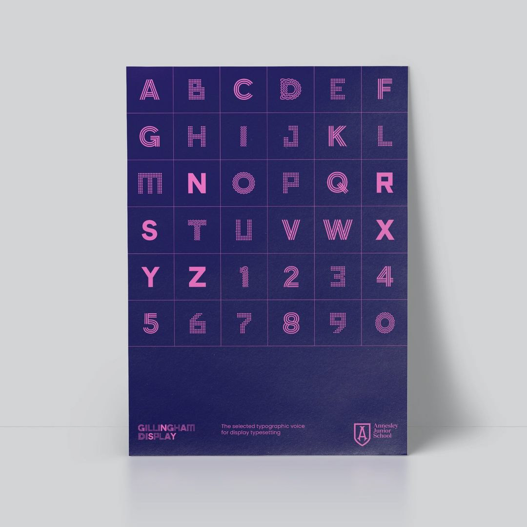
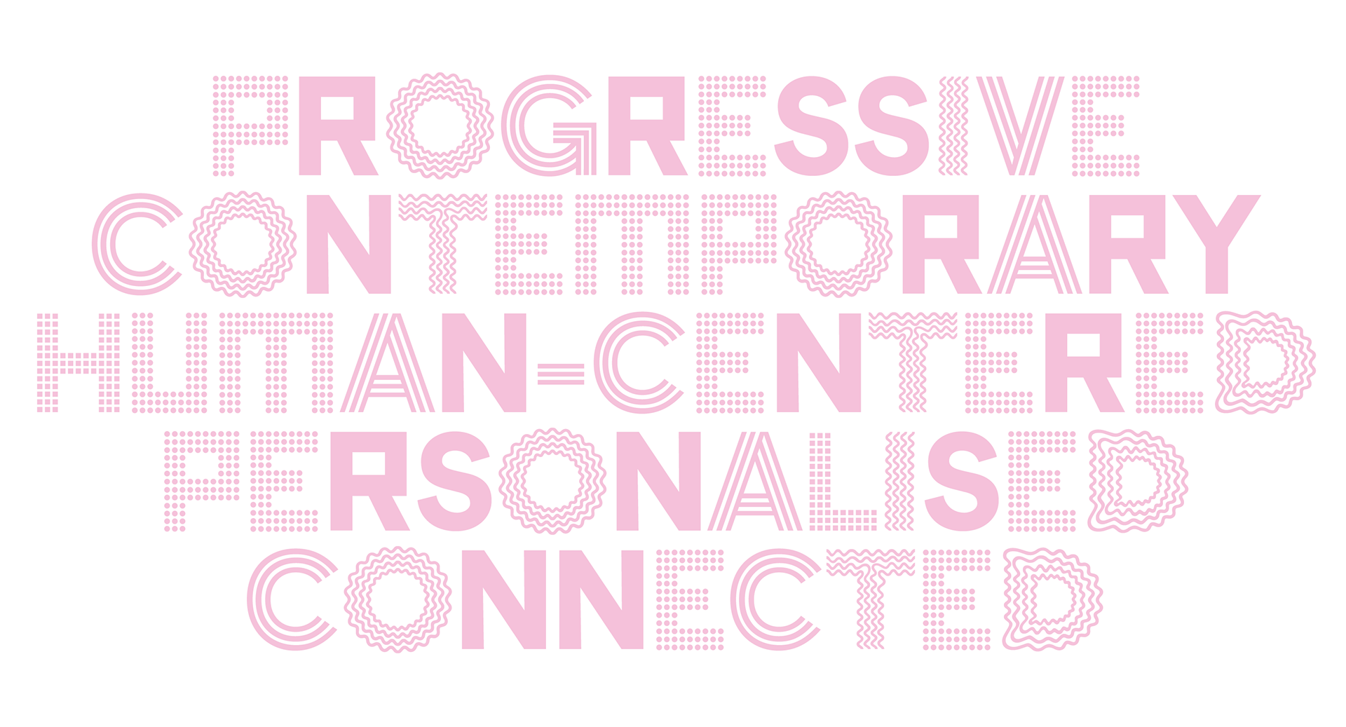
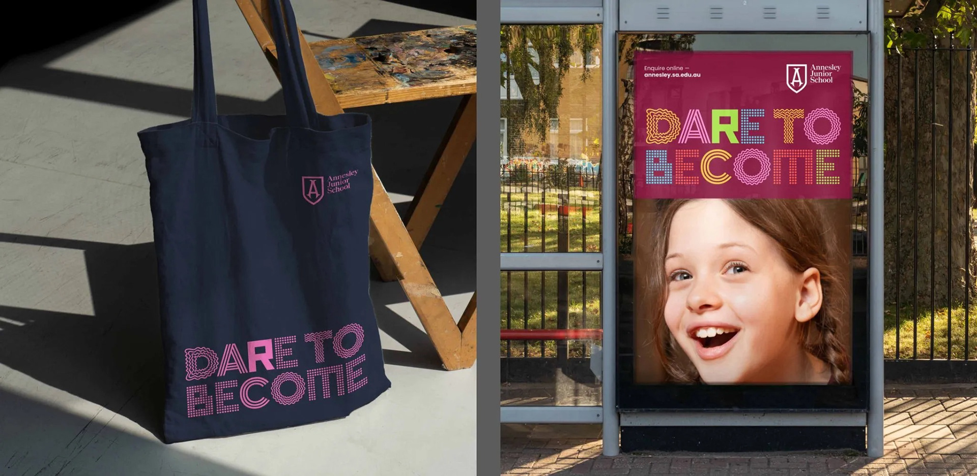
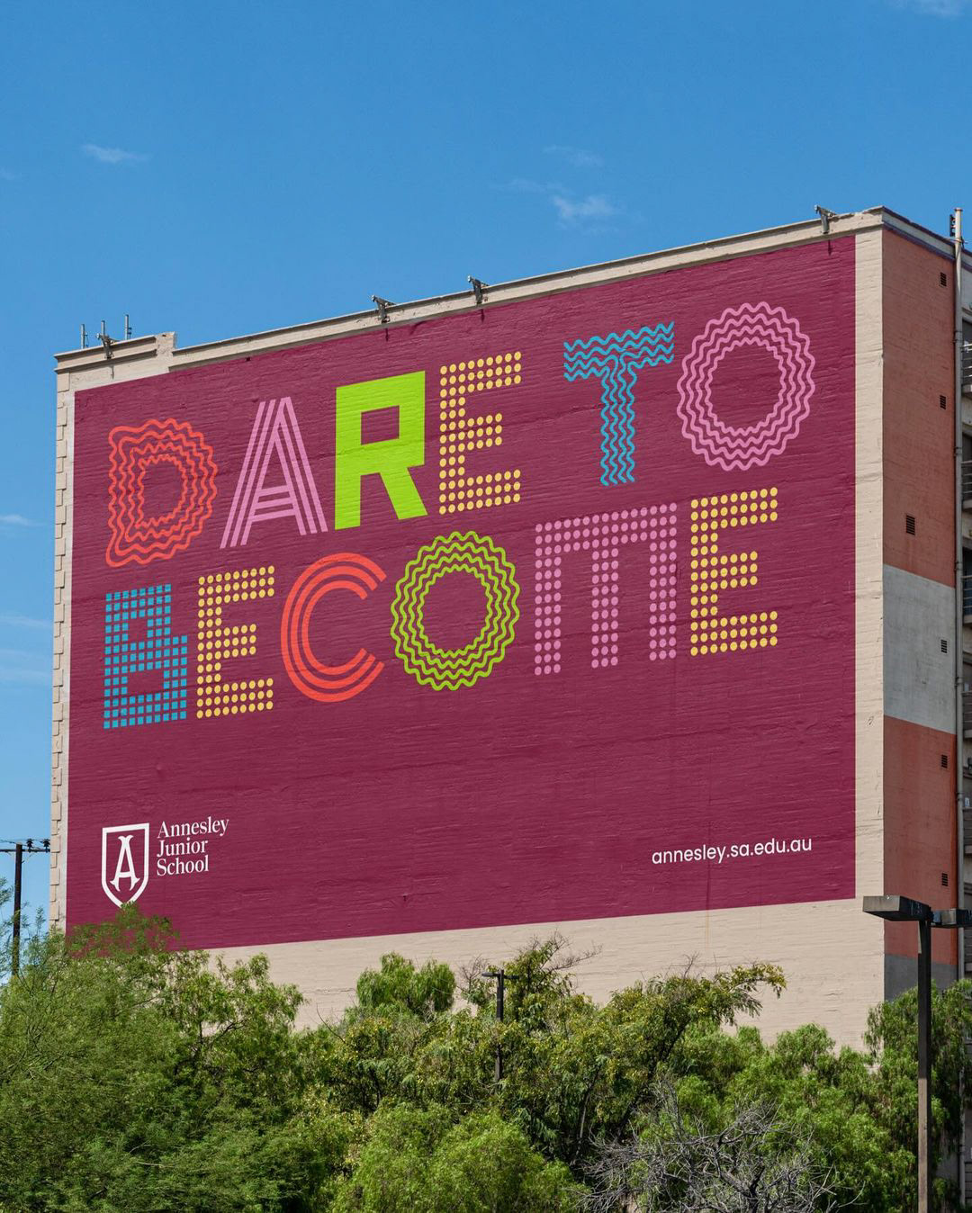
Gillingham Display. A modular, iconographic typeface built from core institutional values.
Custom typeface. Each character is informed by 6 different patterns that reflect the school’s values, giving headlines a confident, human energy. In collaboration with Studio Band we developed a custom display font where every character serves as a vessel for a specific brand value. The task was to translate each value into distinct geometric patterns. These patterns were then layered and integrated into a functional typeface that maintains brand consistency while offering deep narrative storytelling at every touchpoint.
Named for the 120-year-old Gillingham Hall, the typeface bridges past and present, pairing expressive forms with disciplined spacing for legibility at scale.
In social posts, event promotions and campaign work, it becomes an instant signifier of Annesley, lifting recognition while allowing flexible tone from playful to formal.
It is a distinctive brand asset designed to earn memory and build long-term mental availability.ictograms and named for Gillingham Hall, the school’s 120-year-old hall.
Key UI/UX Highlights:
Scalable Iconography: Designed a unified icon set using the same grid and pattern logic to ensure a seamless transition between typography and interface elements.
Systematic Rigor: Developed the font with modular constraints, ensuring it remains legible and high-impact across both physical signage and digital mobile platforms.
Dynamic Visual Signature: Created a unique "visual voice" that allows the school to communicate complex emotional themes through simple typographic forms.
APPROACH:
The Challenge: To modernize a legacy institution’s visual identity into a high-performance, digital-first system that scales from physical environments to mobile interfaces.
The Solution: Purposed Driven Brand System. Co-developed a purpose-driven brand system centered around a custom display typeface. My primary focus was the engineering of this font, which integrates school values into modular patterns.
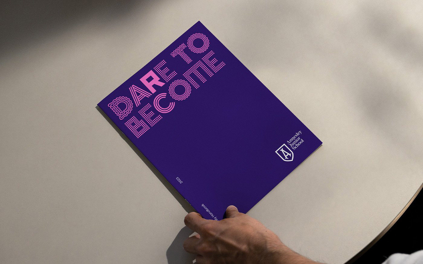
We refined the core brand assets (like the shield) specifically for digital performance and mobile accessibility, ensuring the identity felt "warm" yet technically robust. We built an evidence-based brand system that aligns purpose, culture and communication. Guided by the school motto dare to become, we refined the Annesley shield for digital performance, created a custom display typeface, and evolved the colour system to improve distinction and accessibility. The strategy was informed by a structured stakeholder program to surface shared values and ensure adoption. The result is a coherent, flexible identity that expresses confidence without losing the warmth and heritage that define Annesley’s community.
THE RESULT: The refreshed brand positions Annesley as one of South Australia’s leading junior primary schools, strengthening recognition and community connection. By balancing heritage with a contemporary, International Baccalaureate approach to learning, the identity reflects both the school’s legacy and its progressive outlook.
Designed as a cohesive brand system, it enables clearer storytelling and consistent application across channels — supporting staff, students and families with an experience that feels aligned, distinctive and enduring.
AWARDS & RECOGNITION:
AADC AWARDS FINALISTS — Brand Identity: Small Boutique